Creating Corporate Branding
Our next task was to create the branding for a local business. I thought for a long time and decided that as much as I would like to base this project on a vet or a dog groomer that there is only so much you can do with these types of business and I might not be so great at drawing animals! I then started to walk through the streets of town mentally and think of each business and any that caught my attention. A friend then suggested that I choose Millie and Me, a small vintage boutique that sells clothes and accessories from many different era's.
As with most things I do I went straight to pinterest for some inspiration on what kind of logo would suit this business, what kind of logo's already exist and just some general ideas of what kind of brand I aim to achieve. Here are some examples of what I found:


The main thing that I like about these logo's is that they look very hand drawn and sketchy. I think that a vintage boutique wouldn't really suit a crip, clean logo with straight straight edges and block type. So I think my aim for this project is to create a very unique looking, quirky logo in pastel colours as this would compliment many colours and never create too great a contrast.
I like how in these examples the logo is sort of contained within an outter shape and maybe this would be a good way to go with my logo seeing as the weighting of 'Millie and Me' is not very even at all and could pose some problems in terms of whatever type I choose to use will always look uneven simply because of the uneven lettering.
I like how in these examples the logo is sort of contained within an outter shape and maybe this would be a good way to go with my logo seeing as the weighting of 'Millie and Me' is not very even at all and could pose some problems in terms of whatever type I choose to use will always look uneven simply because of the uneven lettering.
Here is some research that I carried out specifically on clothes boutiques and how they go about making a brand for themself.


Here are all of my initial ideas, I had a LOT of them and this somehow made it more difficult however that happened. I think because most people chose an image related to the name of the business and build a logo around that (for example Pink Bunny using a pink rabbit), whereas Millie and Me doesn't really have any imagery that would be immediately relatible I had to spend a lot of time finding something that represented the business but also was eye catching and special enough to be remembered.
After doing all this and thinking 'I just dont know if i like any of these enough' I decided I should probably get google to help me, there must be some kind of guidelines to this! So I did and here is what I found. It was very useful!
I now knew that I wanted my logo to follow these points and as much as I would like to do a more 'artsy' logo with little flowers and watercolour, it could very easily become out of date with the styles of clothes that Millie and Me sells.
I now knew that I wanted my logo to follow these points and as much as I would like to do a more 'artsy' logo with little flowers and watercolour, it could very easily become out of date with the styles of clothes that Millie and Me sells.
I narrowed it down to two designs that I thought were pretty timeless and versatile and wouldn't look out of place on a clothes label and wouldnt make people go 'eh? thought that was a clothes shop?'. So here they are, I developed them both to see which one I found to be the best.


The first idea I decided to develop was based around an old style postal frank. It came to me after a while of trying to think of something that related to the vintage aspect of the business. I really liked this idea and thought that maybe I could make the stationary look like postcards and old letters and make it all very quirky.
This is how the logo originally started off life. I had been using the tall heart in another idea and decided that maybe it would look nice in this design. After some thought I decided maybe it was too narrow and long and that it unbalanced the feel of the logo. So then I changed it to a smaller, fatter 'normal' shaped heart and I think it did look better. I did a lot of experiments to see which suited the best and this was the general consensus in my family anyway!
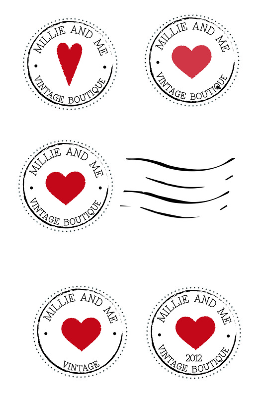
I looked into what actually goes into a franking stamp and they would normally just consist of writing but I thought that wouldnt make for a very good logo but that maybe I should add some more type in to fill in some gaps. As they normally have the date in which something is sent i thought it might be a nice idea to have the date that Millie and Me was established. So in that last example I added in 2012. Later I was told I needed to add 'est' so that people would understand the relevance, so I did!
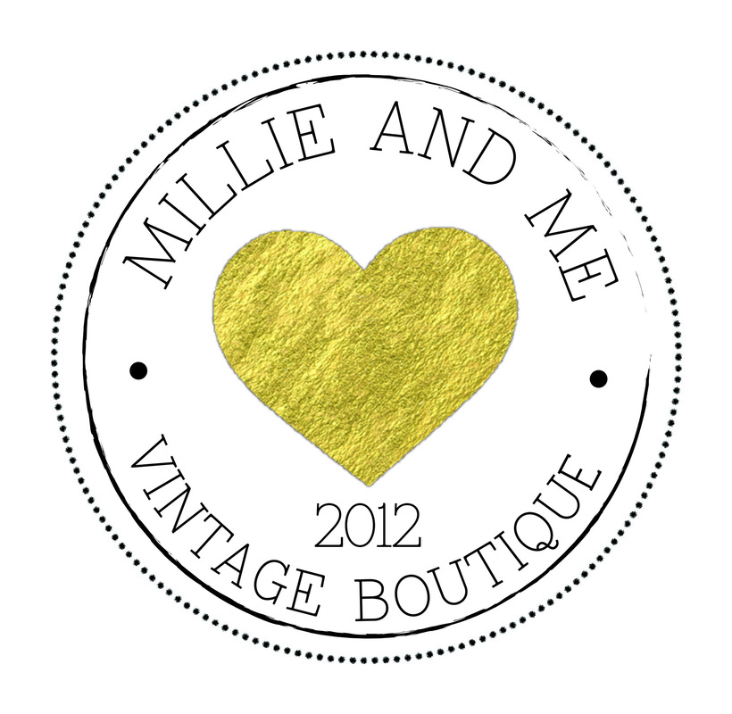
Something made me think 'ooh gold might look nice for the heart' i thought maybe it would make the logo more classy and timeless and less 'typical, hearts are red'. So I watched a few youtube tutorials (http://www.youtube.com/watch?v=1btPP2f8BEo) and hey presto the heart became gold foil! I prefer this logo as I think it would look really good if it was embossed onto the card/paper/etc and really would work well with any fabric or in any environment.
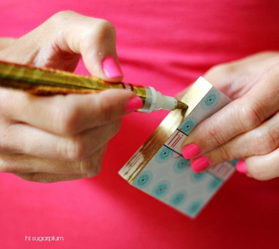
After thinking about how an embossed business card would look very elegant I was looking through pinterest and came across this idea where after the cards are printed you can change the colour of the edges of the card. I think this is subtle but adds to the detail and finishes it off nicely.
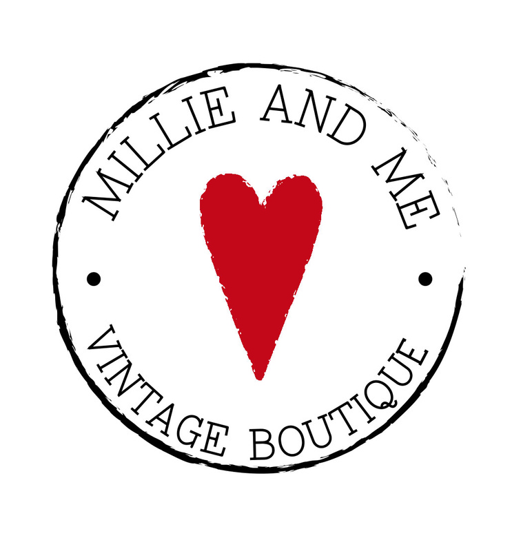
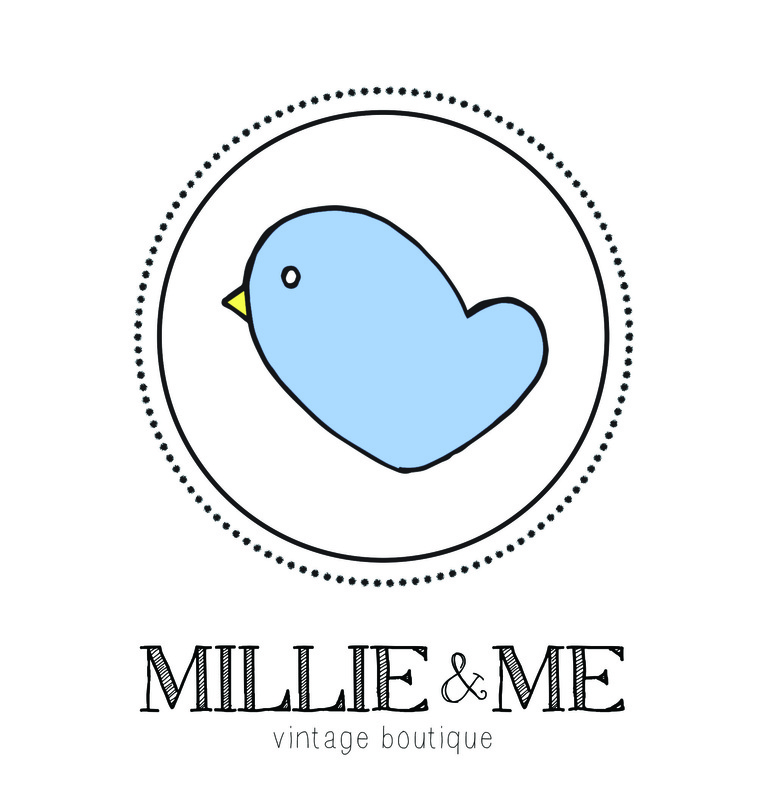
The second design that I decided to develop revolves around a little bird. I was drawing up ideas one day and playing about with different shaped hearts and decided that this heart shape looked a lot like a bird. I don't normally like to draw birds as I can never seem to get the proportions of them right but I think the quirkiness of this one works very well. The bird symbol would also work well to represent the brand as it does have quite a vintage, boutique feel to it.
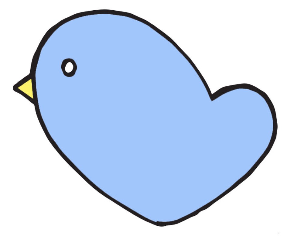
Once I had the general bird shape I then messed about with putting it within different circles, giving it more details and leaving it on its own. I liked the circle with the dots around the outside as I felt like it created a more individual look and it made the logo look more complete and in some ways made it look like a stamp, much like my first idea.


Once I had began to develop this idea I decided that it was probably more suitable for Millie and Me than my first idea as it was a bit more 'cute' and a bit more fun. So now that that was decided I had to choose a suitable font and colour and start putting it to use.
I went through a few different colour options including, orange, lilac, pink and black and thought that the only two that really suited the bird were black and blue. These also tied in well with the bird theme as black birds and blue birds actually do exist. As much as I liked the black, it gave it a very chic and sophisticated look I thought that it would take away from the fun element and maybe give the impression that Millie and Me was very grown up and serious when in actual fact it is very fun and the clothes are bright and playful. So I went with the blue bird in the end up. Even if this logo was paired with an elegant sequin gown I think it would still be suitable and would work well.
I went through a few different colour options including, orange, lilac, pink and black and thought that the only two that really suited the bird were black and blue. These also tied in well with the bird theme as black birds and blue birds actually do exist. As much as I liked the black, it gave it a very chic and sophisticated look I thought that it would take away from the fun element and maybe give the impression that Millie and Me was very grown up and serious when in actual fact it is very fun and the clothes are bright and playful. So I went with the blue bird in the end up. Even if this logo was paired with an elegant sequin gown I think it would still be suitable and would work well.


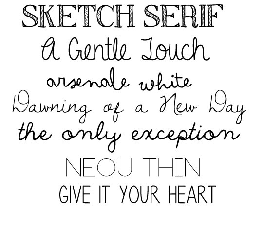
Next I had to choose a font. I decided that I didn't want to always have the type with the logo and that I wanted the logo to stand on its own. I think this is mainly because the of the weighting of the brand name and also because with the logo being a circular shape it could make it look very awkward and just stuck together. In saying that, I really wanted to pick a font that worked well on its own and that could, in some ways, represent the brand on its own. I went through some of my more quirky looking fonts and picked one called Sketch Serif. I feel like the sketchy nature of this compliments the bird nicely and also works well with the brand as a whole. I also knew that I wanted to keep this type black as to not clash or take away from the colour of the bird.
After the final logo and font were decided I then had to come up with the stationary for Millie and Me. I found this task quite difficult and did a good bit of research to help me. I looked at a number of business cards and letterheads and got lots of good ideas, just not necessarily for this project!
Here are some of the styles I came across:
Here are some of the styles I came across:


After looking at all these and finding it difficult to arrange all the information on a small business card here is what I came up with:
I think that if I carried out a lot more research and spent a lot of time when im not at university looking into styles and practising with various pre-existing companies that the ideas would come a bit more easily to me. So I think I'll give that a try some time because I do find it very interesting.
I think that if I carried out a lot more research and spent a lot of time when im not at university looking into styles and practising with various pre-existing companies that the ideas would come a bit more easily to me. So I think I'll give that a try some time because I do find it very interesting.


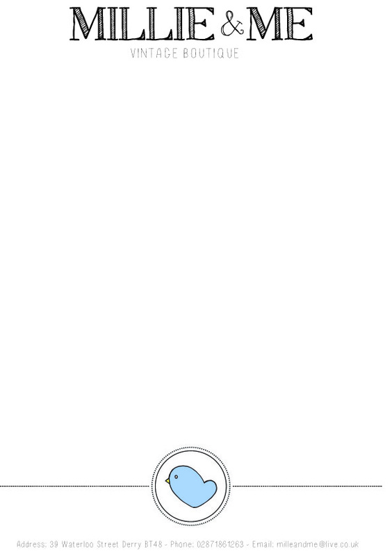
Next I had to look at the letterhead and compliments slip and I had no idea where to start with these so once again I went to trusty Pinterest and did a bit of snooping. I have decided that most letterheads aim to look quite serious and give a very professional look and don't particularly get overly detailed or crazy.


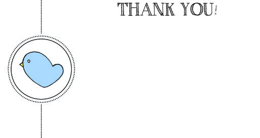
Next was the compliments slip, again, I found that many people were giving off a very very professional feel with these but I thought that if I received a package from Millie and Me I would be much more impressed and pleased if I received something a little bit more friendly and personal. So for that reason I decided to make the compliments card look a bit like a postcard and not be covered in information about the location of the business or any other detail but rather a nice Thank You and a cheerful logo! I am pleased with how this turned out!