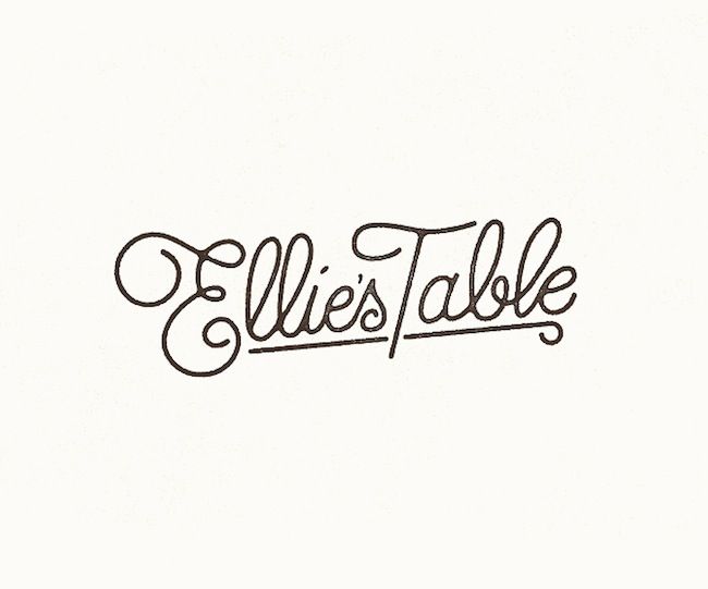
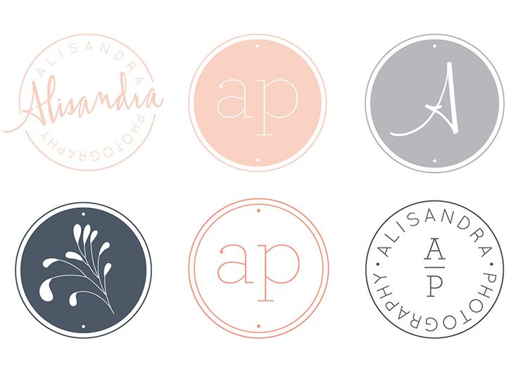
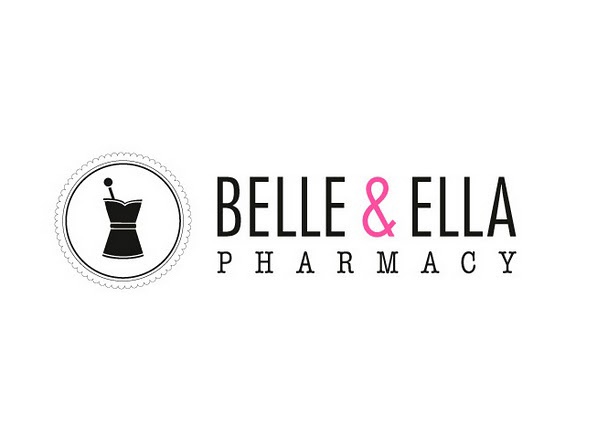
So we were given the task of creating our own branding, make a logo, make an identity. I started off by going to trusty pinterest and looking at some branding of existing companies and also finding some graphic designers that I think create good brands.
(here's my pinterest link if you're feeling nosey: http://www.pinterest.com/felicityjane24)
(here's my pinterest link if you're feeling nosey: http://www.pinterest.com/felicityjane24)
I made a few quick initial sketches of possible logo ideas in class. I think I prefer to use my full name instead of just my initials because I think an F and an s don't particularly go very well together. Anyways, here is what I came up with, I will do some experimenting on illustrator and see what looks good and what doesn't!
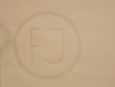
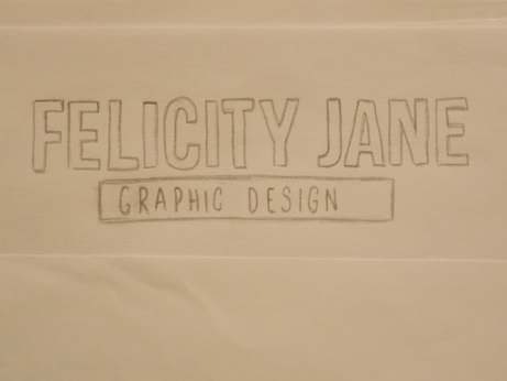
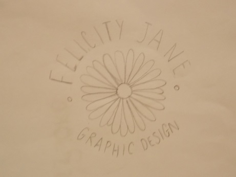
I decided that if I was going to incorporate some kind of image into my logo it should be something with a special significance to me instead of just any old thing that I like the look of. so it didn't take much thinking at all because a daisy has a lot of relevance to me and just so happens to look rather nice as a logo which was very handy! out of my quick sketches my favourites are the circular logo with the daisy in the centre and also the horizontal type and daisy based logo idea.
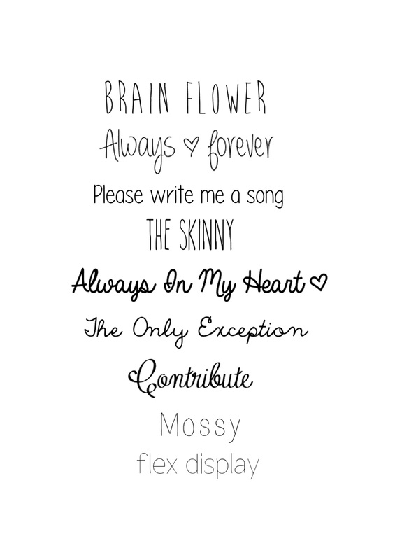
Seeing as type is going to be a major part of my design I went and looked about various font sites and came up wth a list of what I feel are the most suitable fonts:
Seeing as type is going to be a major part of my design I went and looked about various font sites and came up wth a list of what I feel are the most suitable fonts:
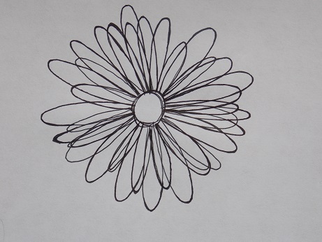
After finding some suitable fonts I then decided it was time to draw my daisy to be used as my logo. I wanted it to be noticeably hand drawn and sketchy looking. so here it is:
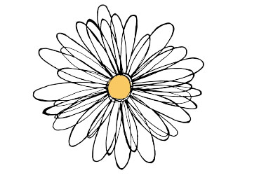
And here is the finished illustrator version. I do love live trace, it is a life saver when you can't figure out how to make accurate pen paths ...
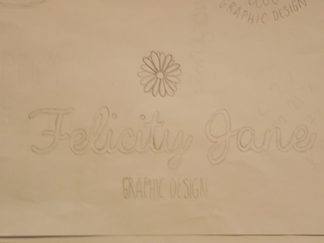
The next step was the tricky part, how do I go about creating my ideas? I gave it a fair go and I watched a few youtube tutorials and I somehow came up with two pretty close attempts:
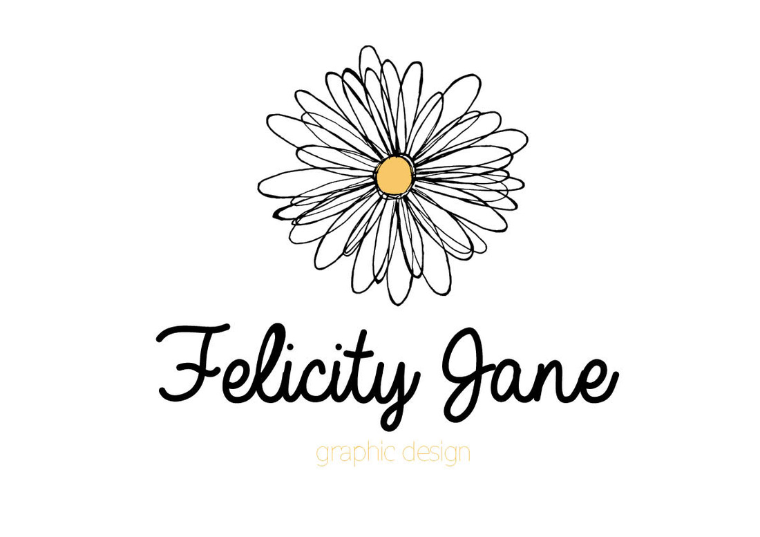
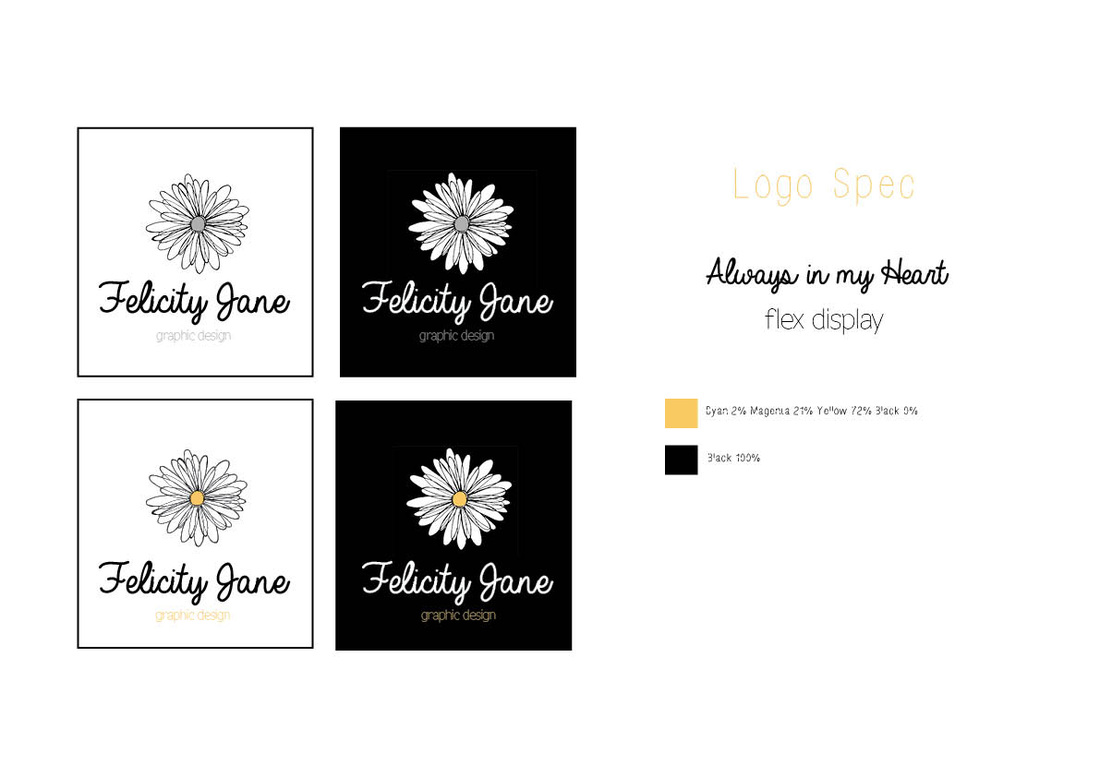
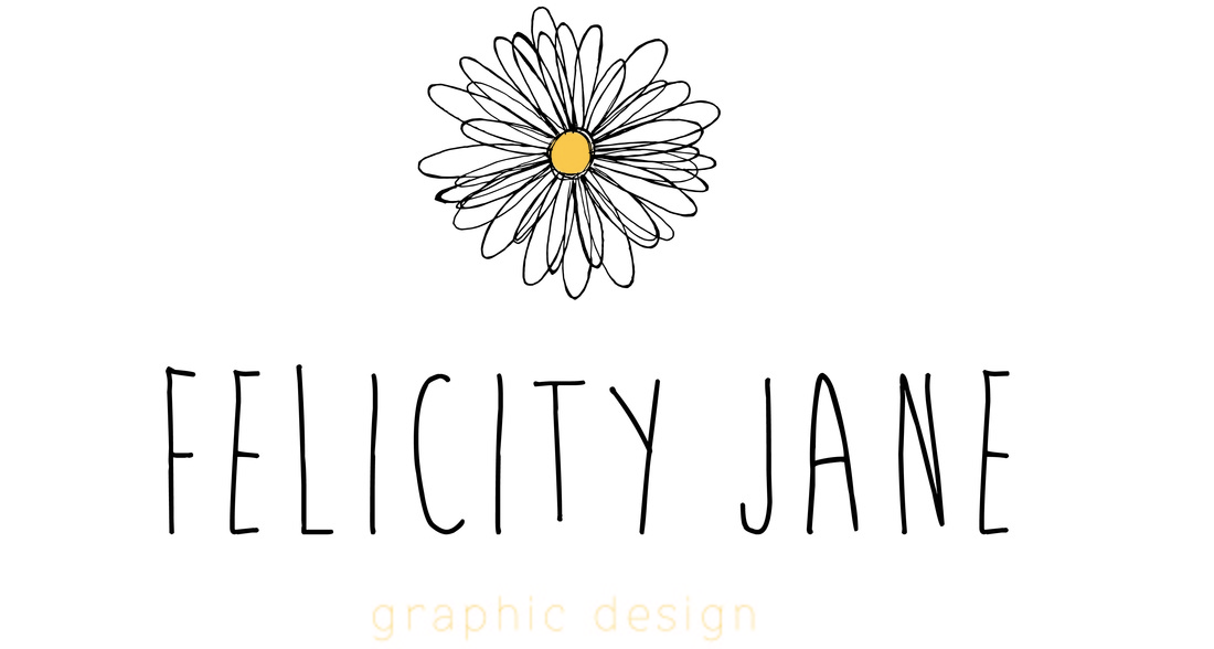
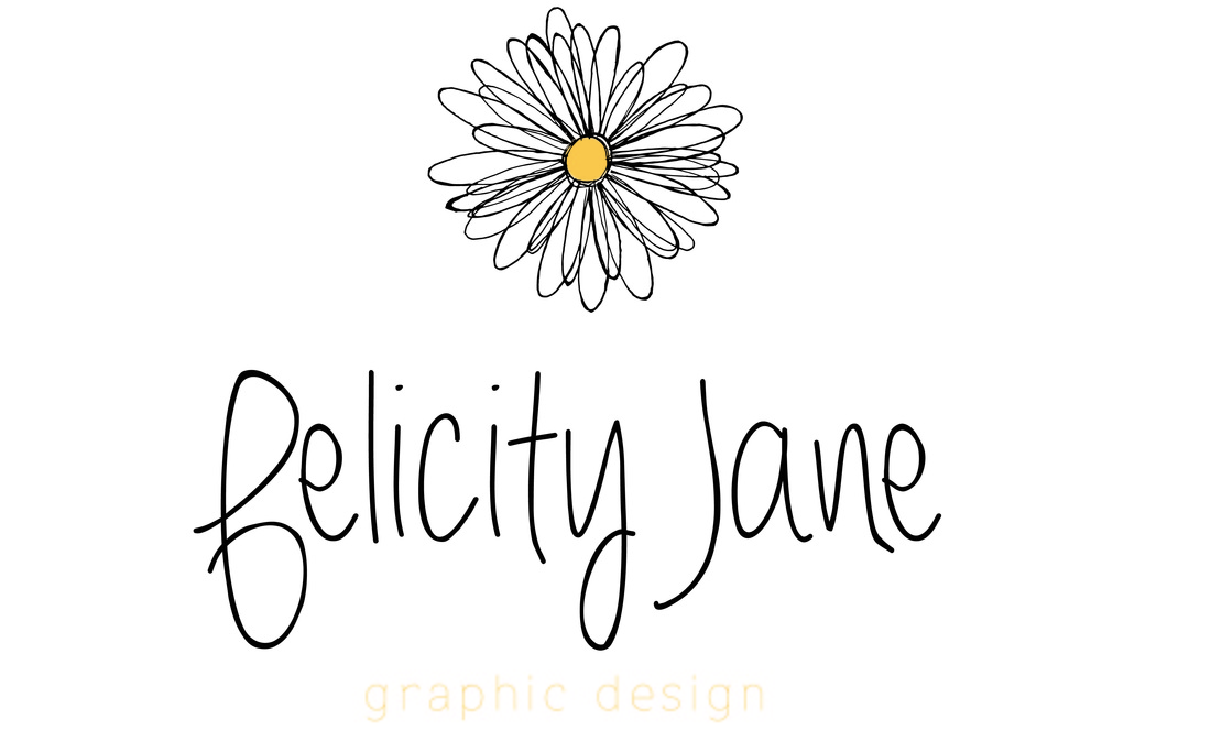
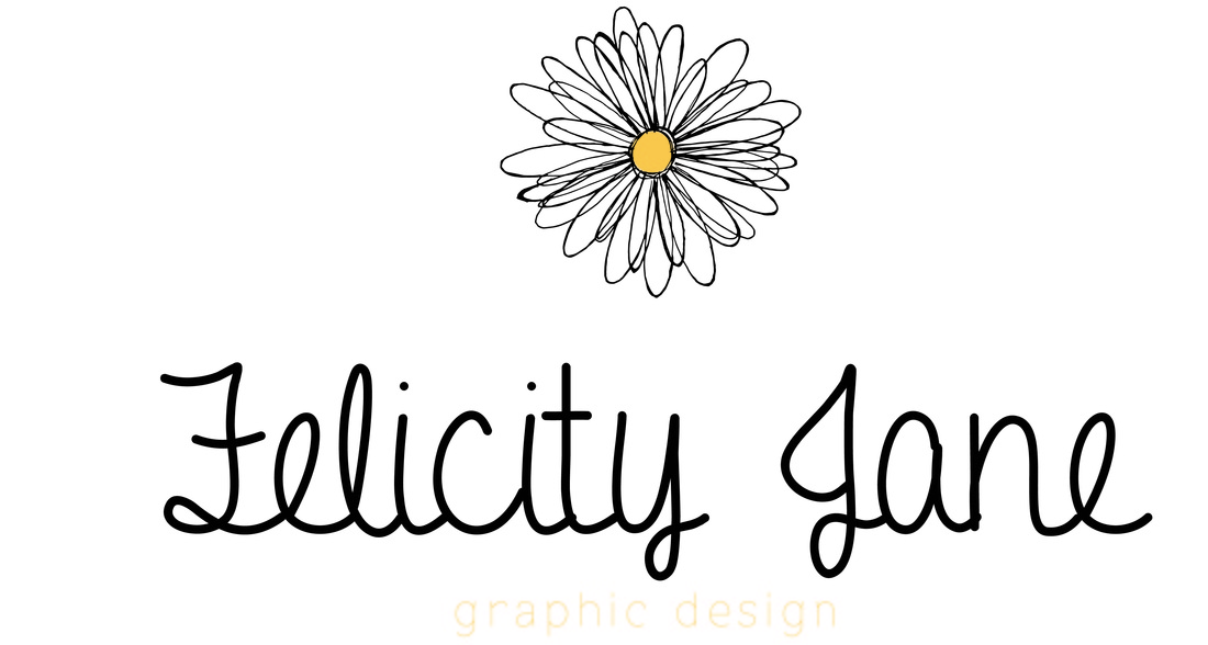
I used the fonts Always In My Heart and Flex Display because I feel like they compliment each other and represent me well as a brand. I used a classic yellowy orange shade for the centre of the daisy and then took this same colour and used it to accentuate the graphic design type to create some contrast attention for it without distracting from my name.
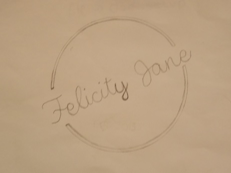
The second idea that I had for a logo was a circular one based again around a daisy. On paper I feel that this looked really good but somehow when I went to create it on illustrator it didn't quite look right. I think the problem is due to the fact that the daisy is not a perfect circle so this sets off the balance of the type a little bit.
The second idea that I had for a logo was a circular one based again around a daisy. On paper I feel that this looked really good but somehow when I went to create it on illustrator it didn't quite look right. I think the problem is due to the fact that the daisy is not a perfect circle so this sets off the balance of the type a little bit.
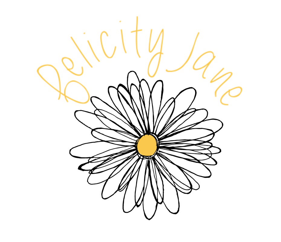
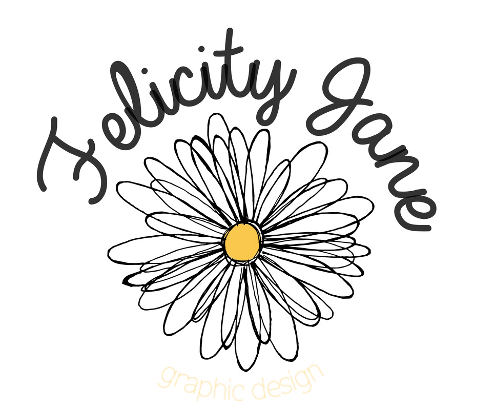
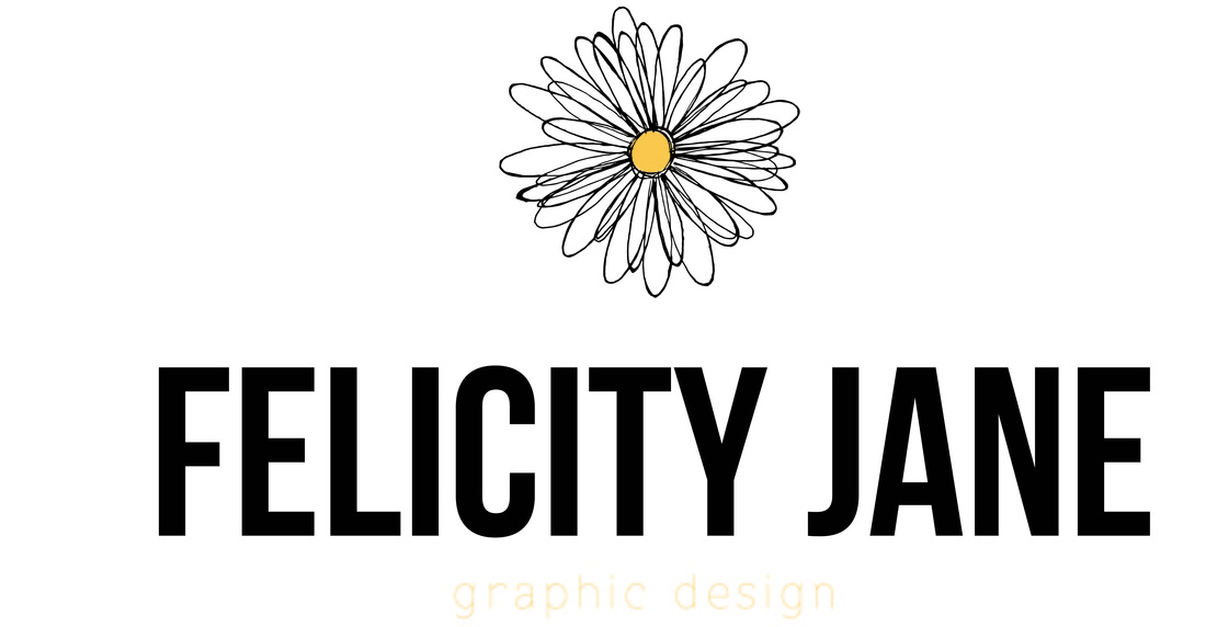
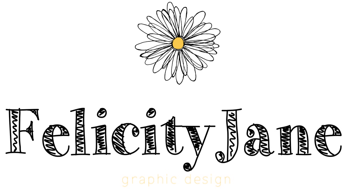
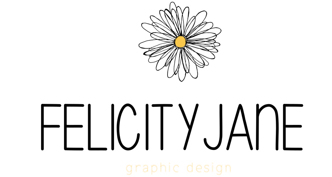
I tried using some different fonts including, The Skinny, Flex Display and Always In My Heart and stuck to the same colour scheme as the previous design. I really wanted this design to work but there is something about it that just doesn't look quite right. If you can tell me how to make this any better please feel free to!
Once I decided that the horizontal logo was what I wanted I went ahead and experimented with different fonts and colours. I have a feeling my initial colour scheme and font will be the one I choose though because I feel like they are classic and simple yet effective and will work with any environment that they are put it.
Once I decided that the horizontal logo was what I wanted I went ahead and experimented with different fonts and colours. I have a feeling my initial colour scheme and font will be the one I choose though because I feel like they are classic and simple yet effective and will work with any environment that they are put it.
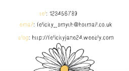
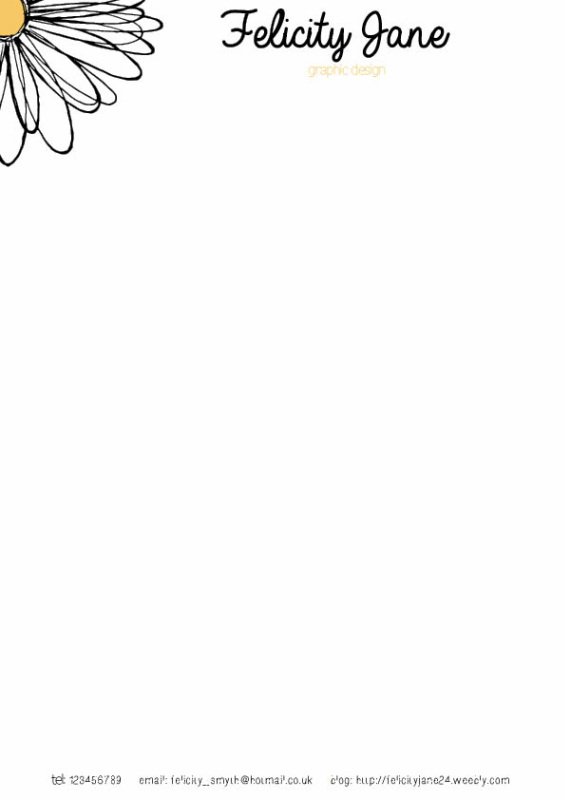
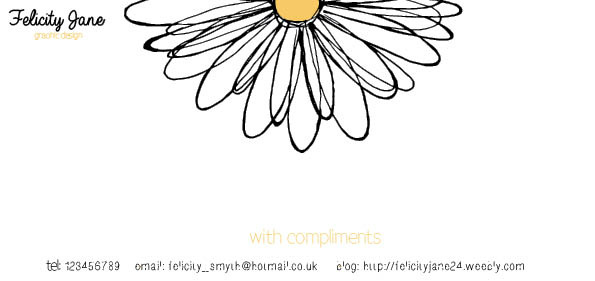
Seeing as at this point I much prefer the first
logo design I went ahead and created a letter head, business card and compliment
card. I think they look very nice, sometimes a bit hard to fit all the different
elements in which is where I think the compact circular logo would be useful but
I am still really pleased none the less!
logo design I went ahead and created a letter head, business card and compliment
card. I think they look very nice, sometimes a bit hard to fit all the different
elements in which is where I think the compact circular logo would be useful but
I am still really pleased none the less!