Creating An interview
The last project that we had to do was to create an interview. Interview someone with an interesting story, make it look interesting and like a magazine editorial. I started off by looking at some examples of interviews and some examples of editorials as I had never really paid much attention to either of them!


These were my favourite three styles. I like the arrangement of photographs in the Malta article and I liked how there wasn't a lot of text, it looks inviting. The fonts used in the space article and the emphasis put onto the heading were interesting in that editorial, it's eye catching and again intriguing. My favourite however was the first, i like the way it doesnt look over fussy, it looks rough yet neat at the same time and creative and bright. This kind of messy style is something that I like. I want to incorporate this style into my own editorial and add some images in as well
Next I had to decide what to do an article on. This was a bit tricky because my mind just went a bit blank and decided that I knew no interesting people. I do. I have interesting friends, I have interesting family members but I decided that a lot of peoples articles were going to be based on these two sets of people. So I interviewed myself. I thought it would be interesting as not a lot of people in the university setting know a lot about me. It would be different from lots of others and this is the kind of interview I read the most. There used to be a phases on Facebook where people would fill in these surveys about themselves and I always found them weirdly interesting. I guess I'm just very nosey!
So I searched through the internet and I used some resources given to us to pick a number of questions to answer that gave a wide variety and some interesting points to read. I don't want to seem big headed that I interviewed myself, that I couldn't find anyone more interesting than me. I just thought it would be interesting and a bit different!
So I searched through the internet and I used some resources given to us to pick a number of questions to answer that gave a wide variety and some interesting points to read. I don't want to seem big headed that I interviewed myself, that I couldn't find anyone more interesting than me. I just thought it would be interesting and a bit different!
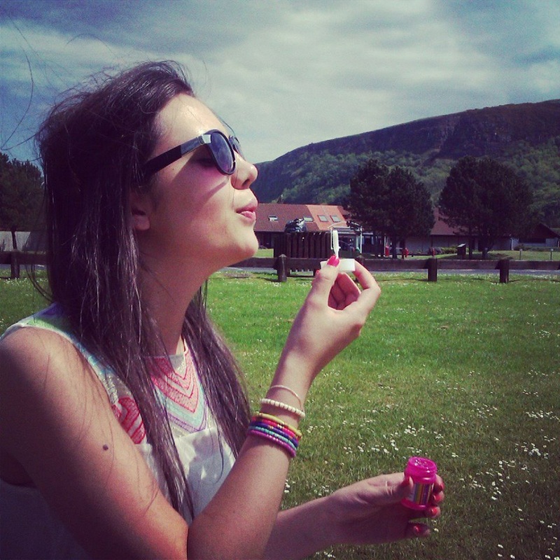
This is the photo that I decided to use to illustrate myself. It's a pretty accurate portrayal. I Like bright clothing and jewellery, sunshine, being outdoors and I always have bubbles in the car everywhere I go. I don't know why, I just do.
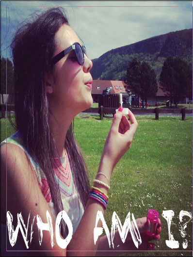
I thought this photo would be nice as a page on its own and that maybe I could put text over the top and then have the interview on the right hand page. I thought that a brush type font would work well with this photo. My favourite brush type is Levi Brush but it unfortunately has license restrictions so I had to find the next best thing, 'Brushed'.
Here is how it looked with the type on:
Here is how it looked with the type on:
Next I had to add actual content. I looked a bit more closely at the actual writing in editorials and looked in magazine that I had laying around to see what way they layed out personal interviews. I had a rough idea that they used the same font for both questions and answers just in different formats, bold and italic for the questions, regular for the answers. It took a long time to find a font that offered all these variations but that also suited the rest of the layout. In the end I went with 'Lucinda'. I think it works pretty well.
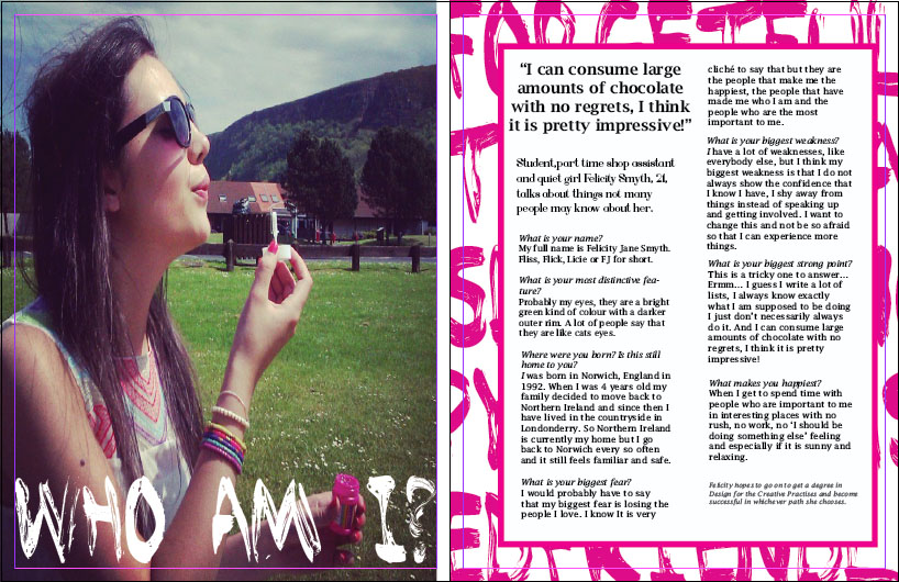
I had to come up with an interesting way to lay out the interview that worked well with the image and had enough detail to not look plain and empty. I decided that maybe picking out some of my character traits and writing them in Brushed would look well. I didn't want to just have them randomly across or to distract from the content so I decided to make them into a background. I picked out the pink colour of my nail varnish in that photo as it provided enough contrast between the two pages and yet wasn't over bearing.
Here is the final interview